All aspects of the design process, from initial research to final solution development and usability testing.
6 Weeks/ Solo Project / Deliverables: Interactive Mockups & Usability Testing Report
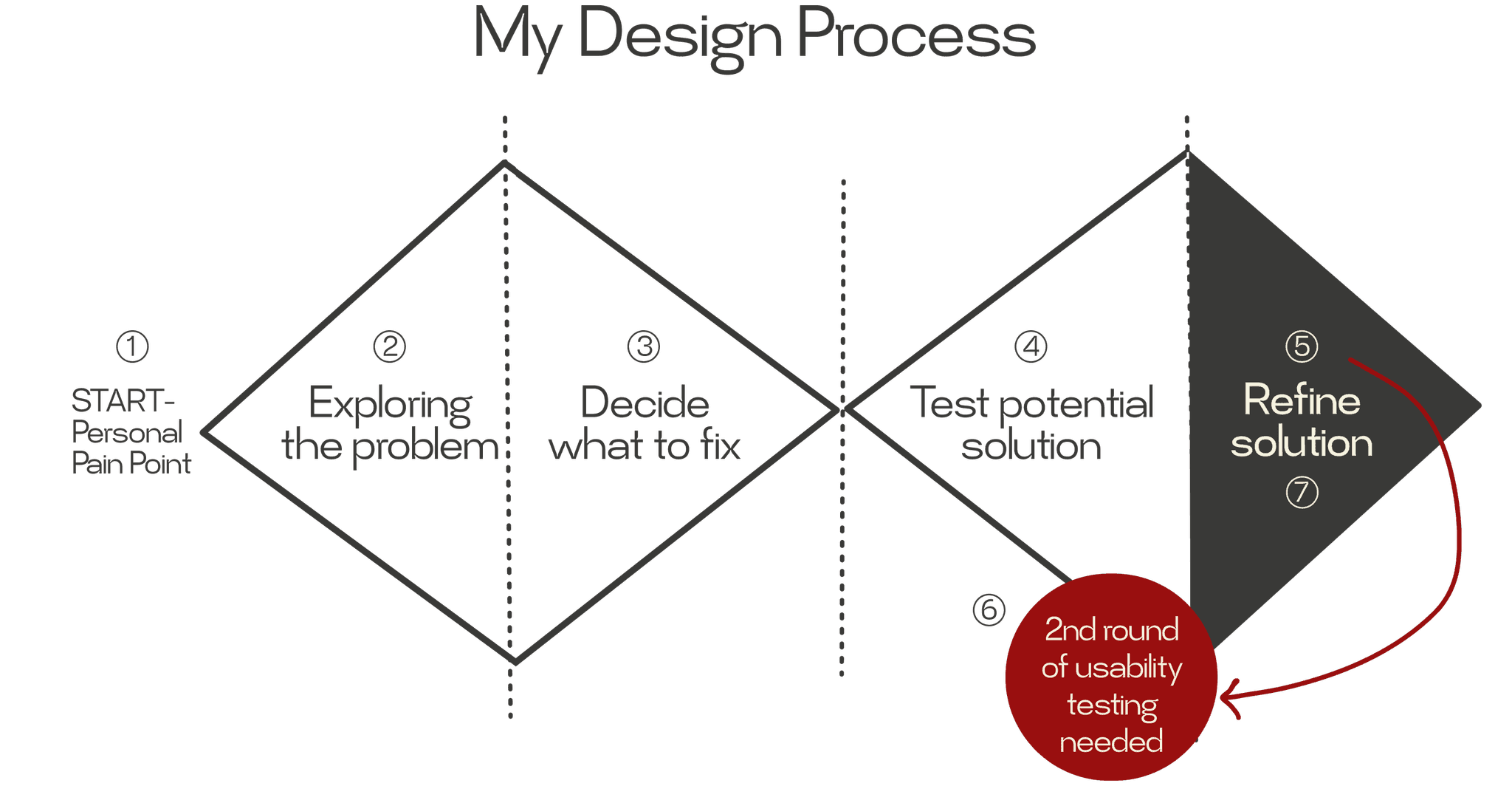
DESIGN PROCESS
My design process for this travel app began with in-depth research, revealing users' struggles with information overload. Using tools like proto-personas and journey maps, I identified key pain points.
Figma File Link : Unfoldr - Discover & Define
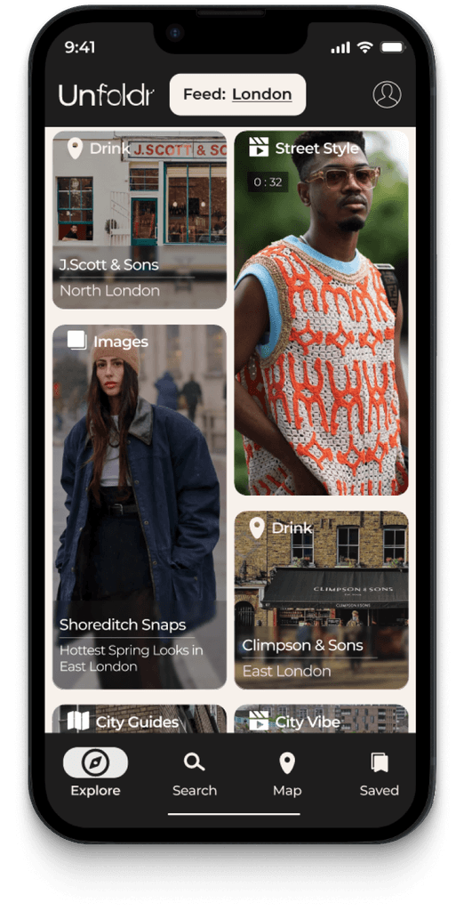
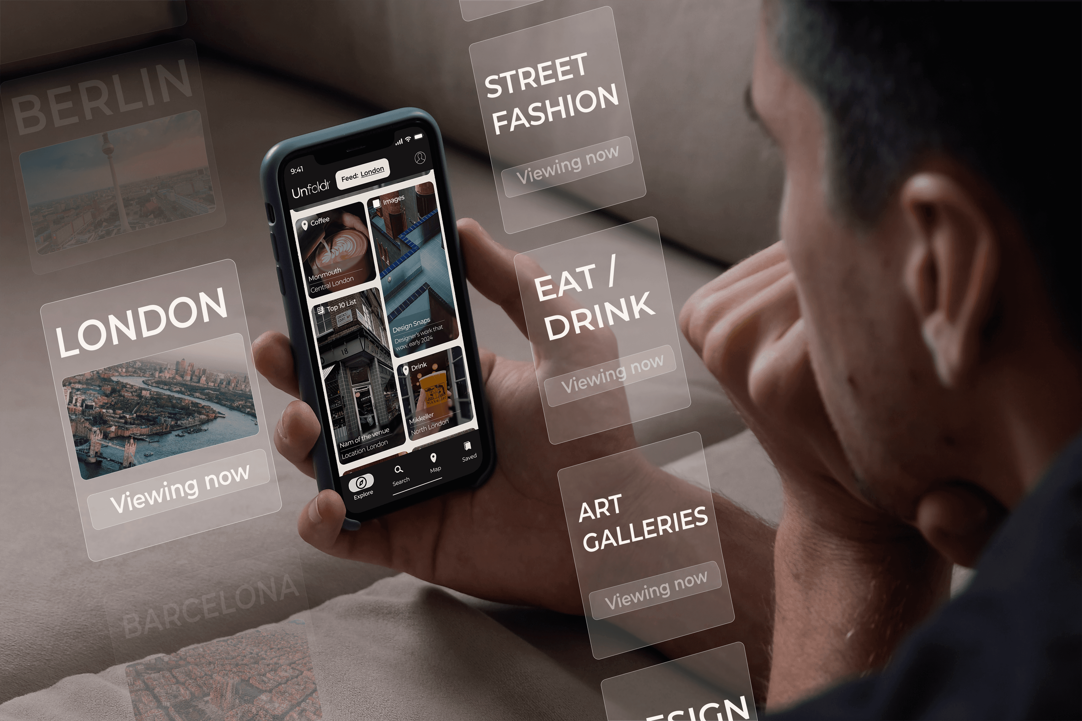
This led me to focus on user's needs: destination discovery while keeping in mind to create a quality of curated content. I developed an information architecture and key screens, resulting in a prototype that aims to streamline travel planning with rich feed screen, search and filter functions and map feature.
The plan to delivered a polished solution and move on to UI and building the app further. But, the testing had low success rate...I had to go back to DEVELOP & TESTING phase.
DESIGN Development
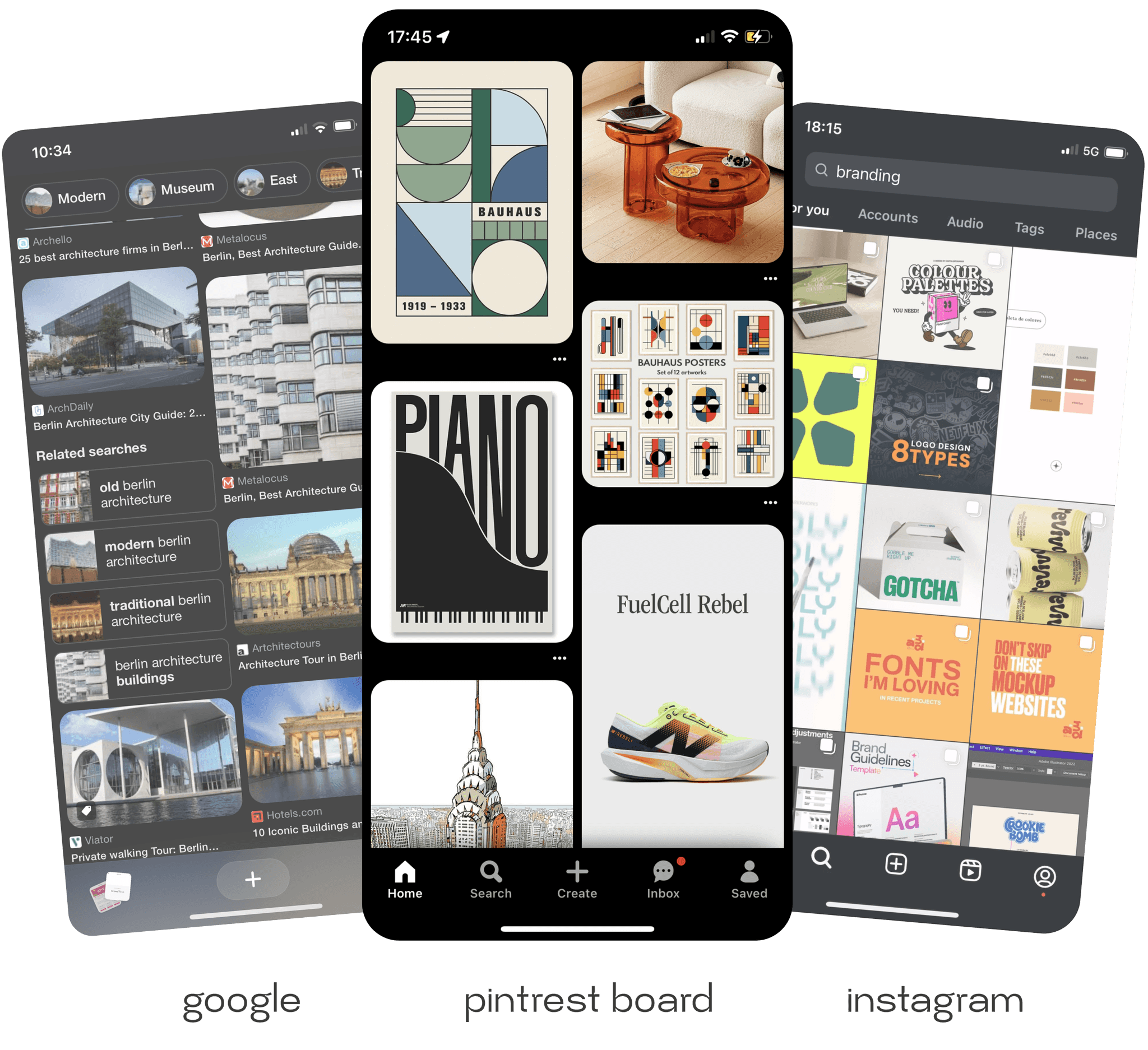
Based on digital trends and user behavior research, I hypothesized that a mixed-media feed could balance informative travel content with quick, visually appealing formats. To test this, I designed a prototype featuring a social media-style feed, prominent search and filter functions, and a map feature- as the app is for travel discovery.
Initial Mid-Fidelity wireframe for Feed Screen
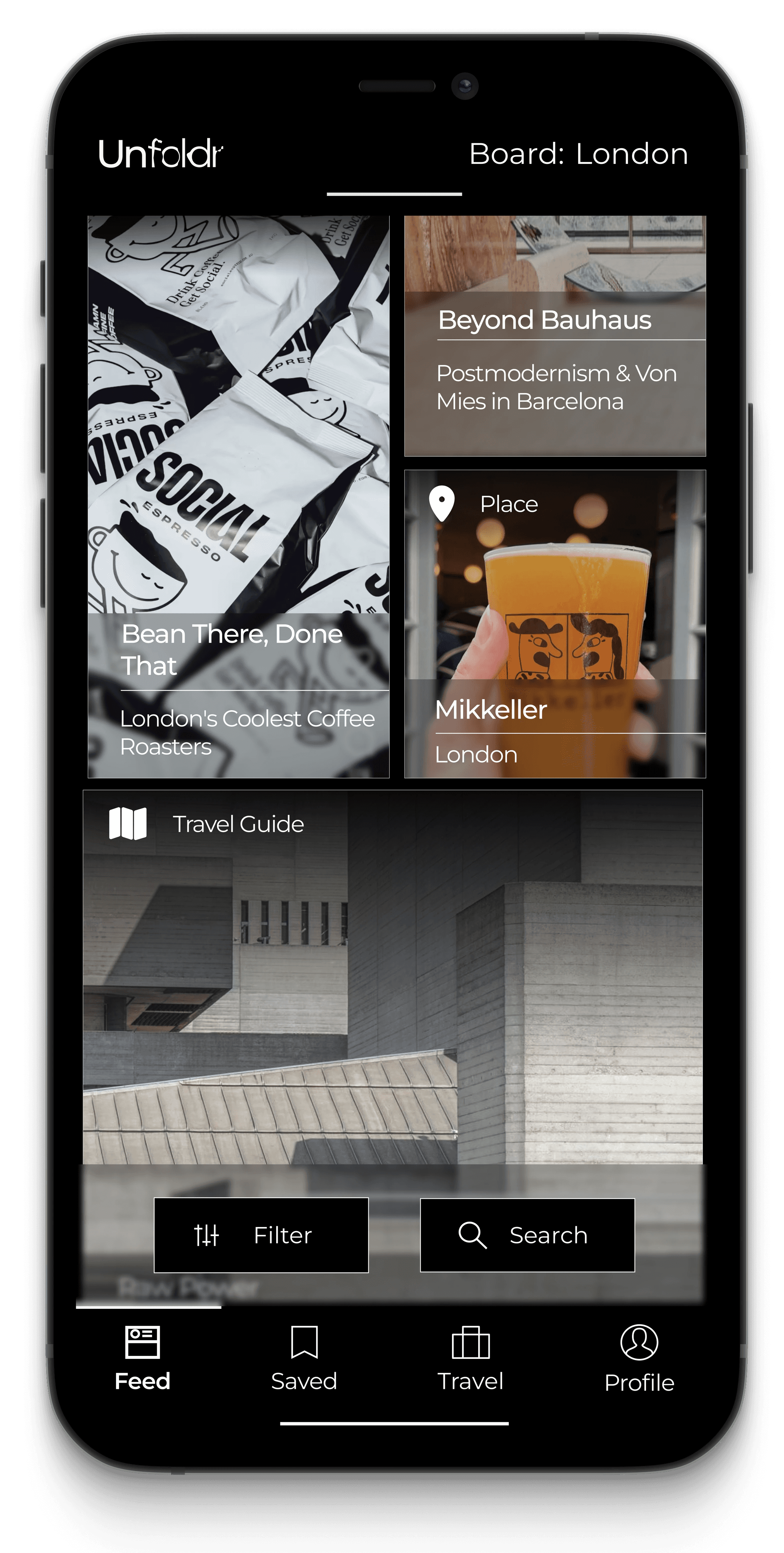
Inspirations: Mixed-content feed inspired by social meadia
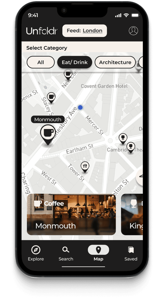
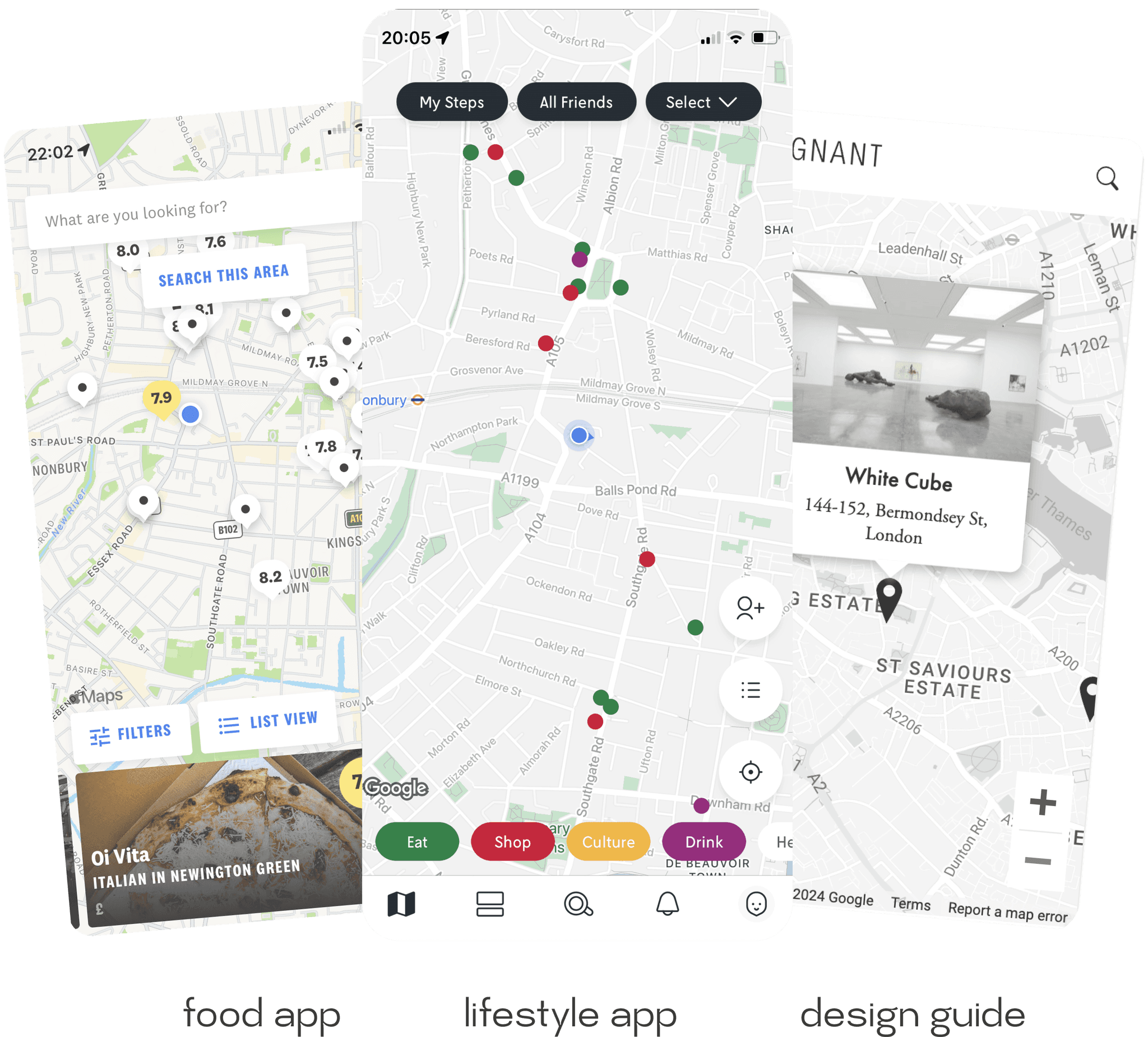
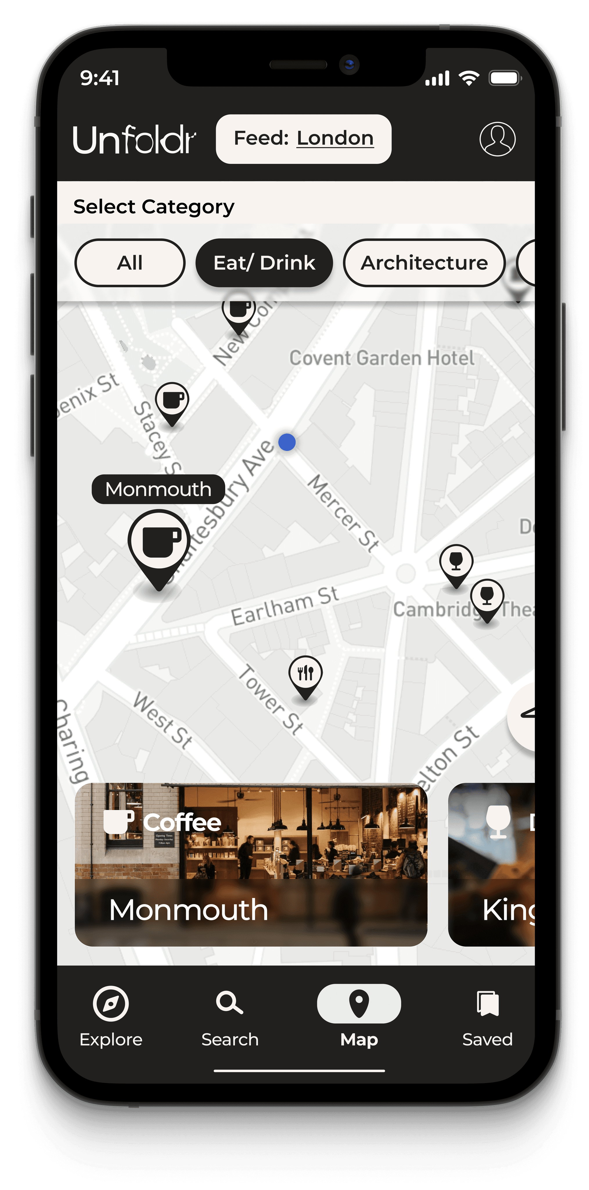
Initial Mid-Fidelity wireframe for Map Feature
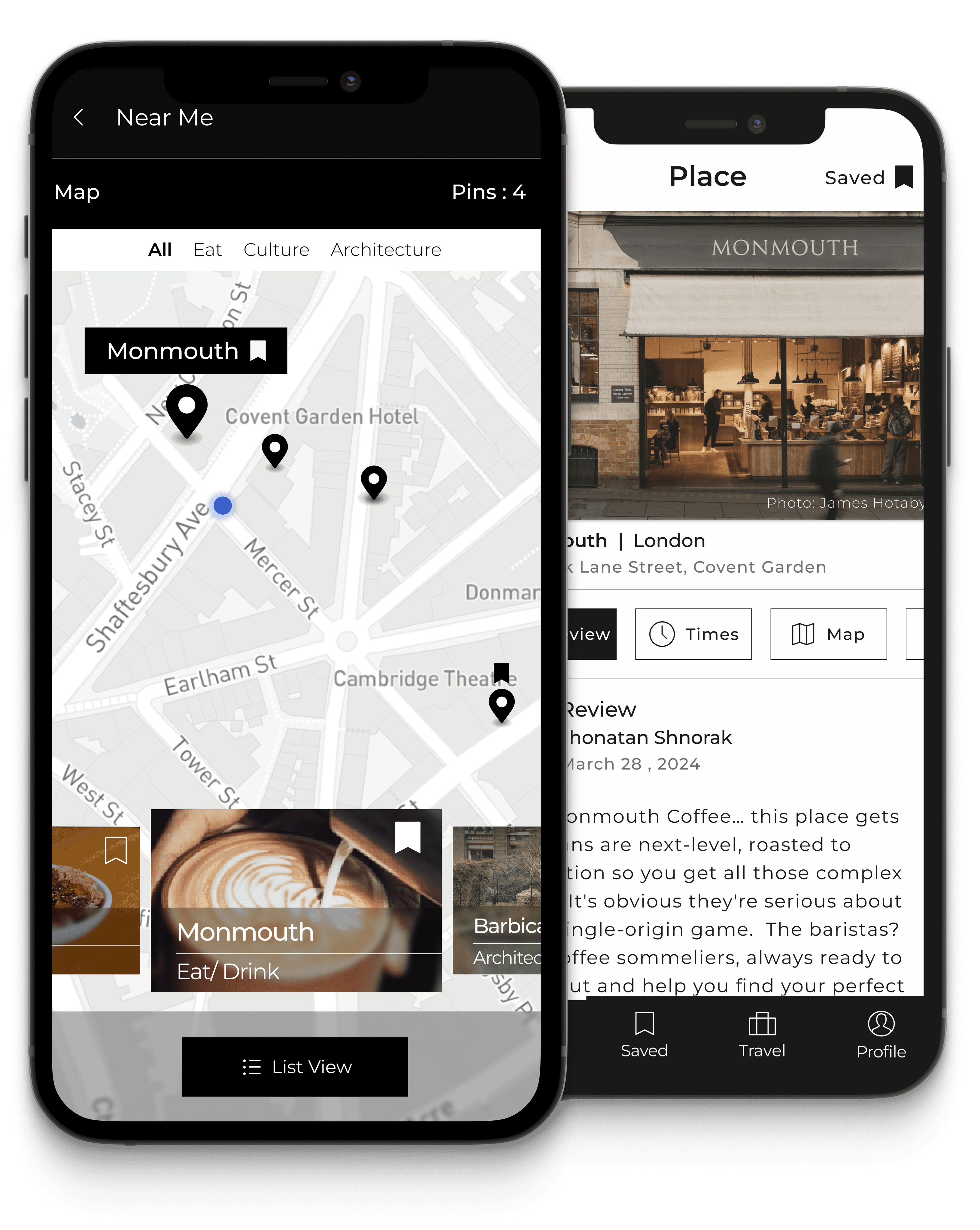
Inspirations: Map feature is integral part of travel apps.
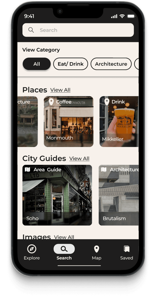
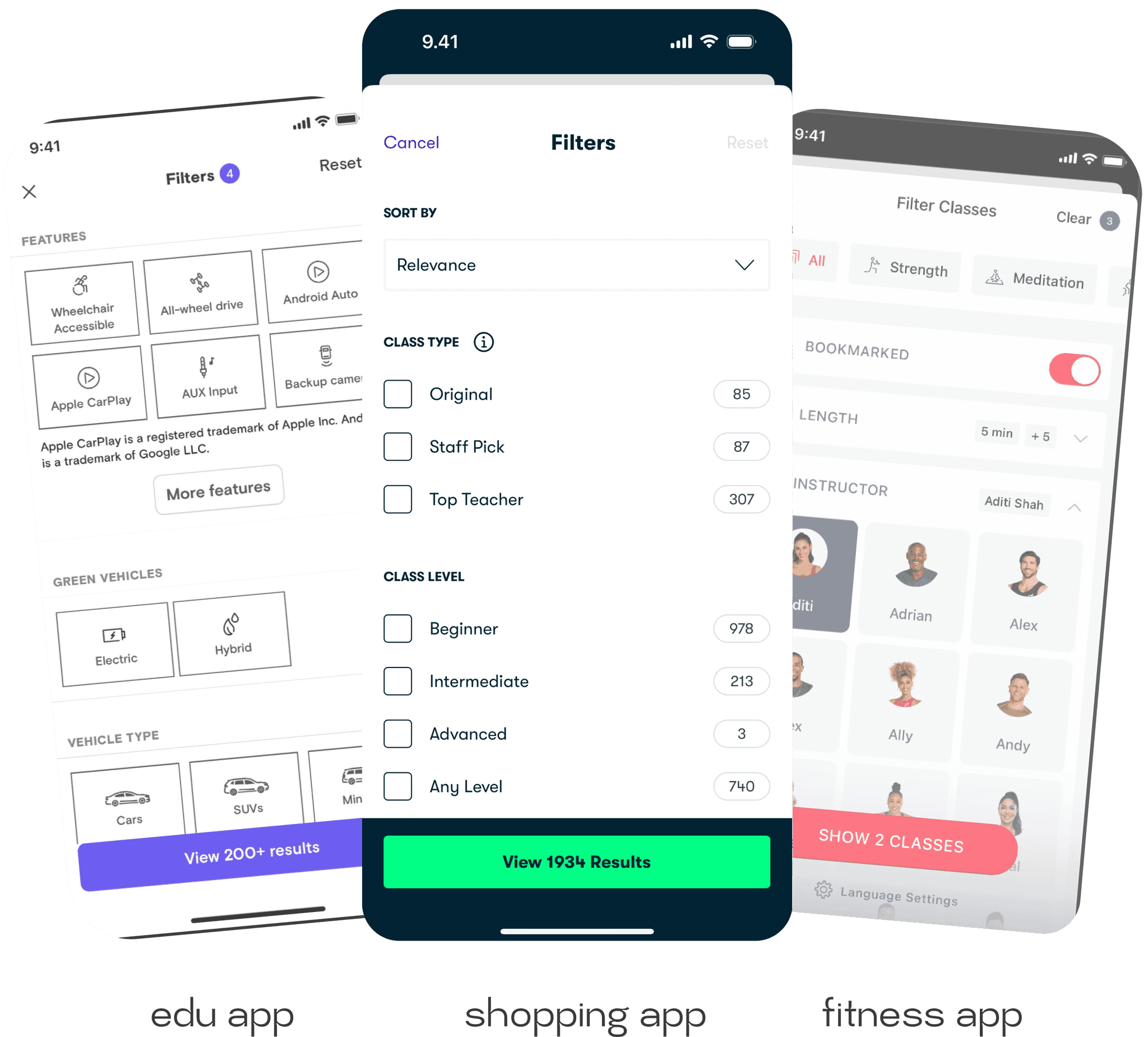
Initial Mid-Fidelity wireframe for Filter & Search Feature
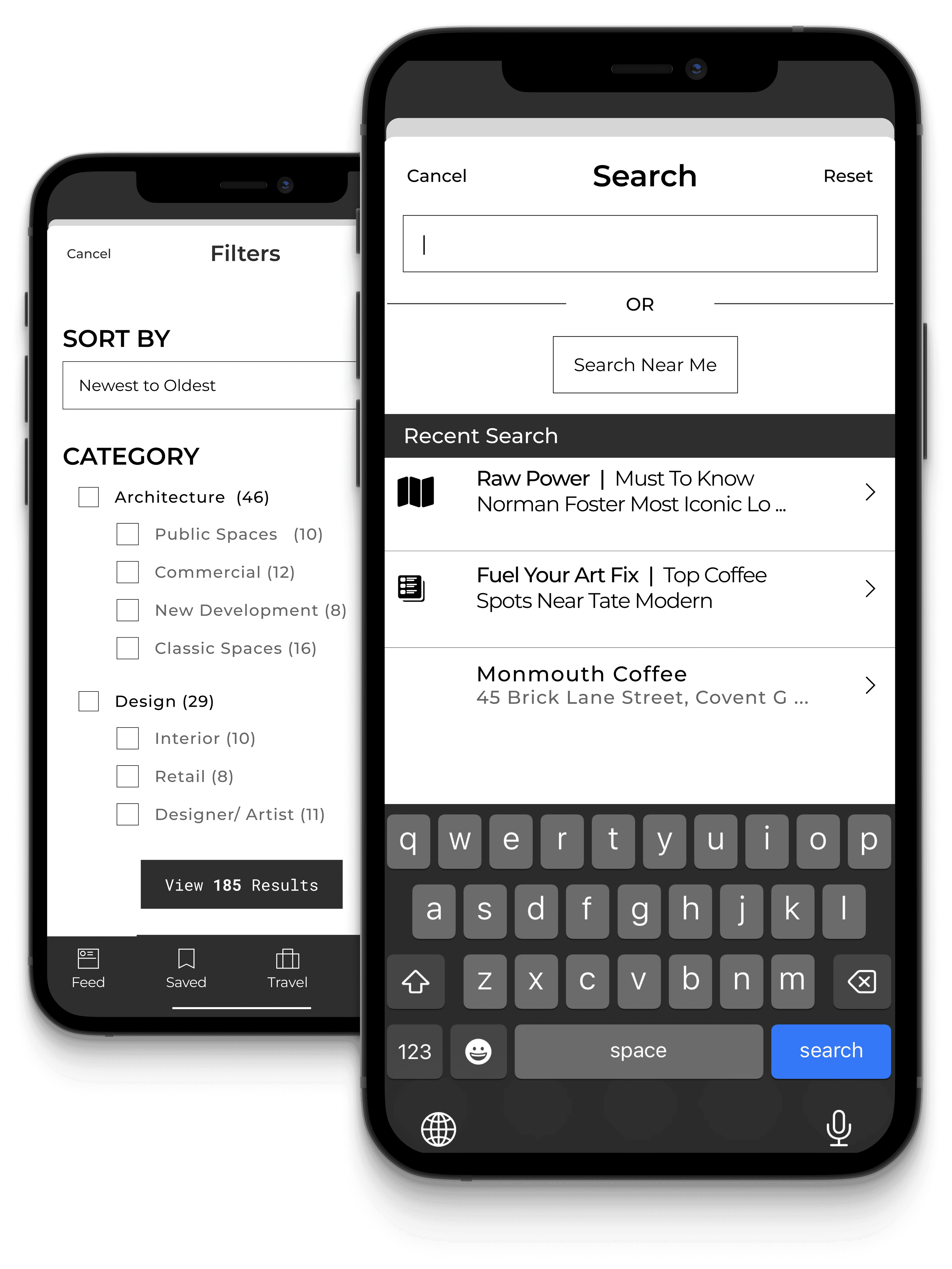
*To enhance usability and discovery-
I incorporated search and filter features
Inspirations: filter and search feature across apps from different categories
This approach aims to streamline travel planning while accommodating various user needs. The next step is to validate this design through user testing to determine if it enhances travel planning efficiency and meets modern digital preferences.
THE USABILITY TESTING
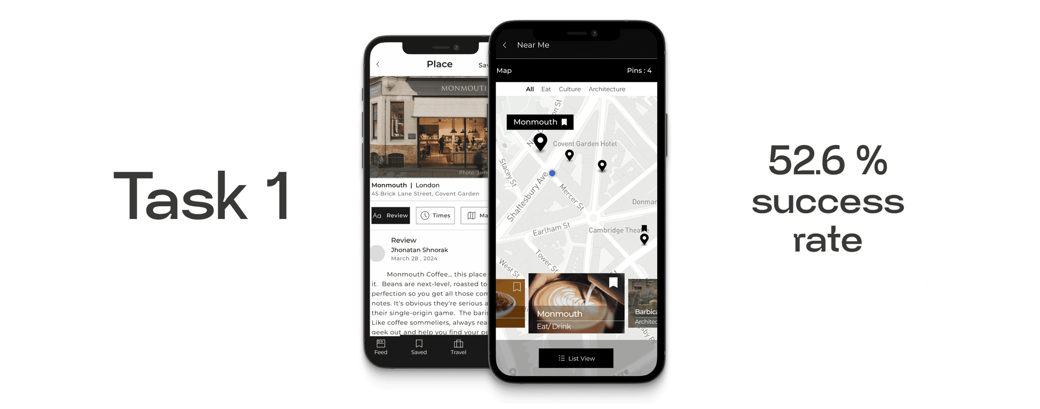
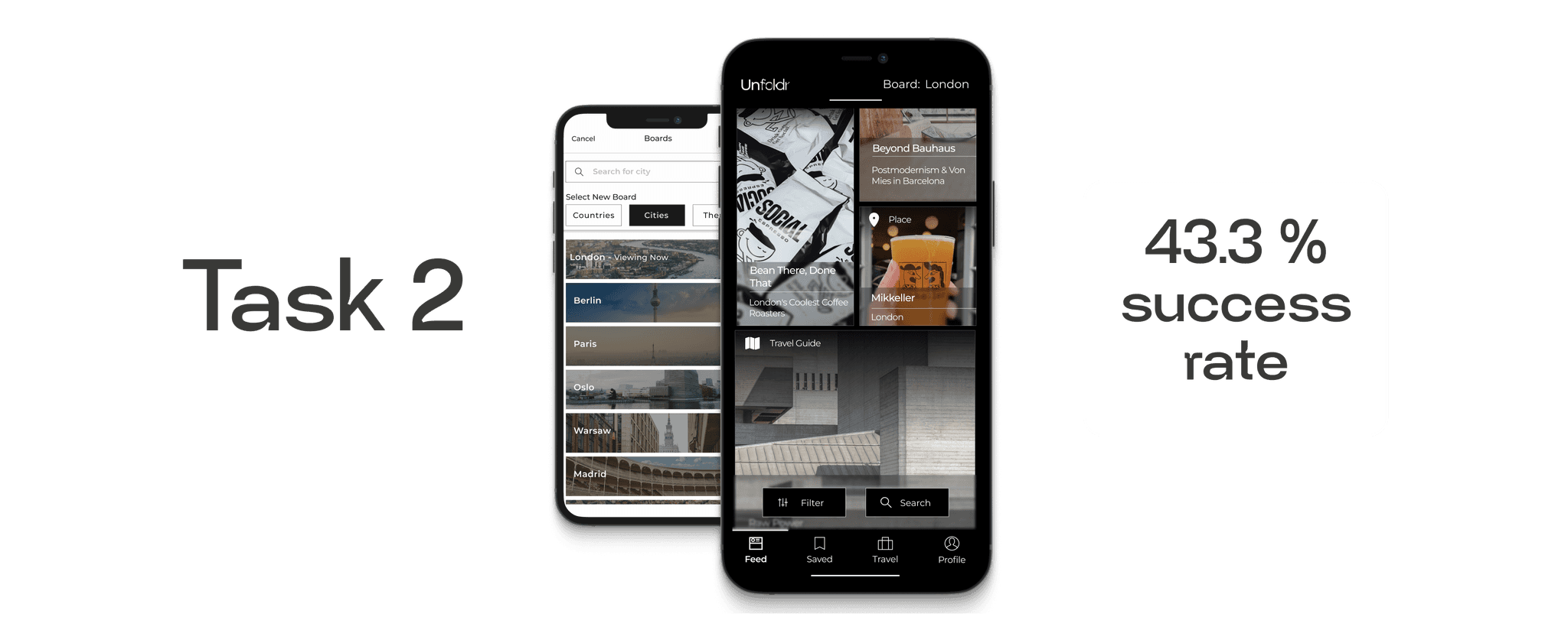
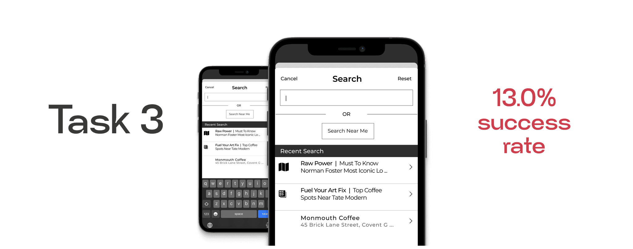
I tested the prototype with 67 participants using maze.com. The focus was on the city-specific feed and search/filter functions. Results were mixed, with low task completion rates.
Key issues included search bar problems, mobile visibility issues, unclear search scope, and confusing terminology. These results indicate that I had to re-think design and concept.

Explore more about usability testing tasks and results in Figma File- follow the link : Unfoldr - test report
IMPACT - before and after
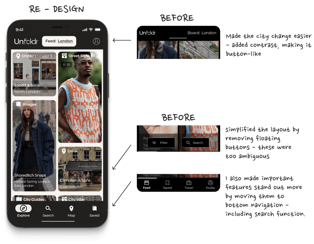
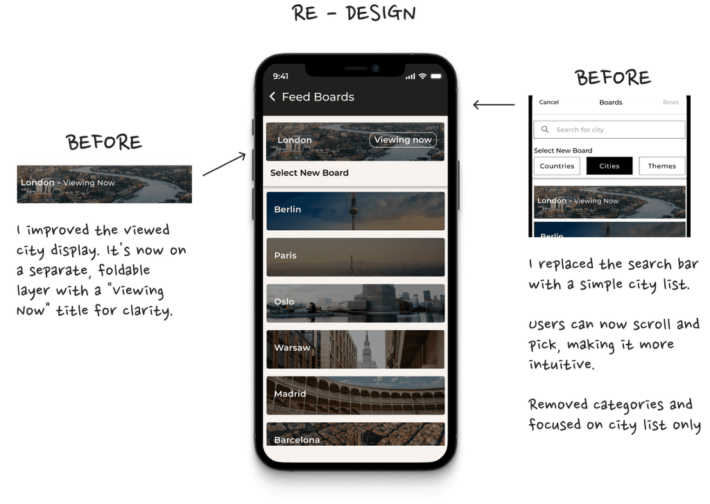
Testing revealed users had trouble changing cities and finding the features. In response, I focused on improving feature prominence and enhancing visual cues.
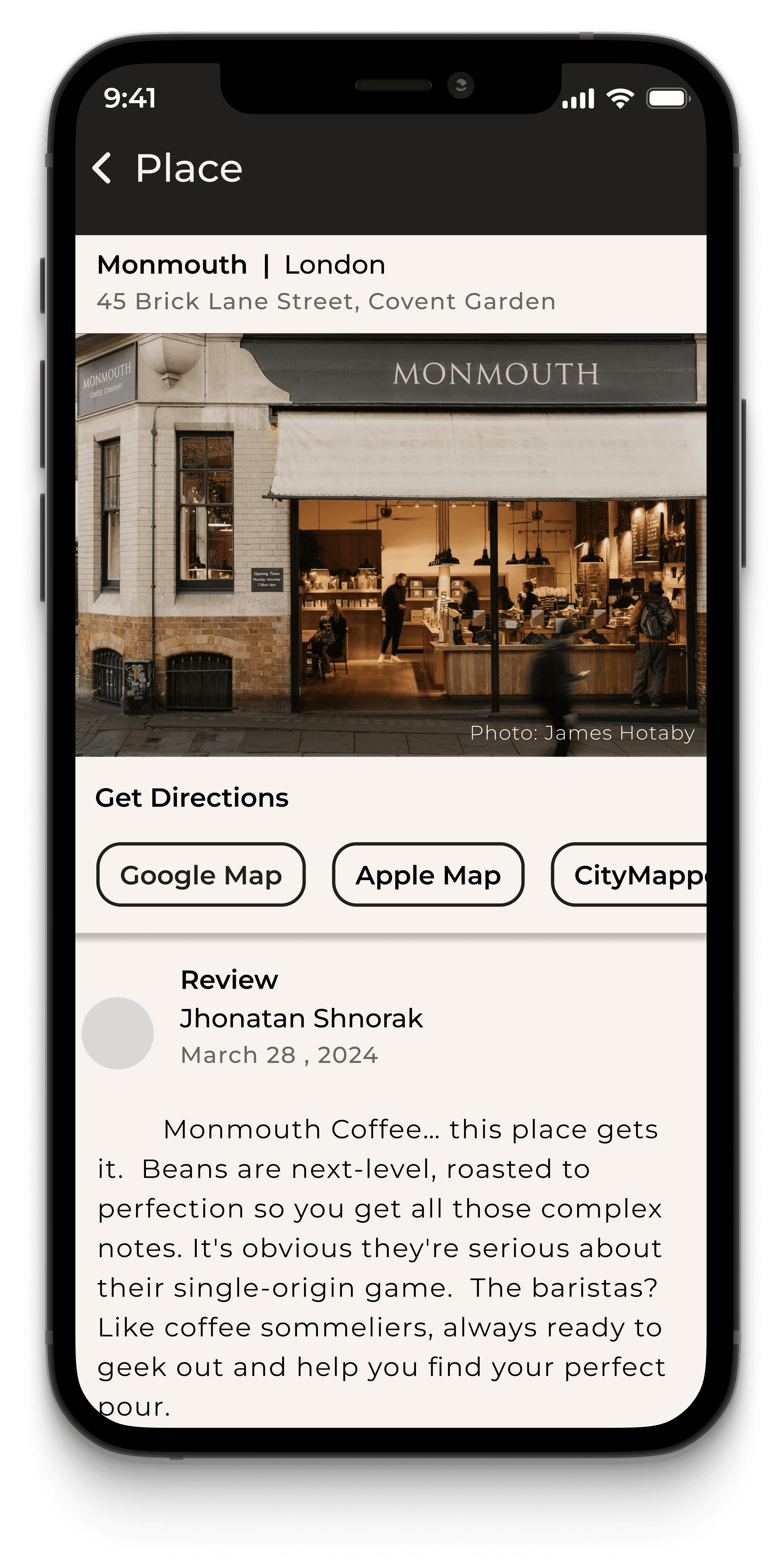
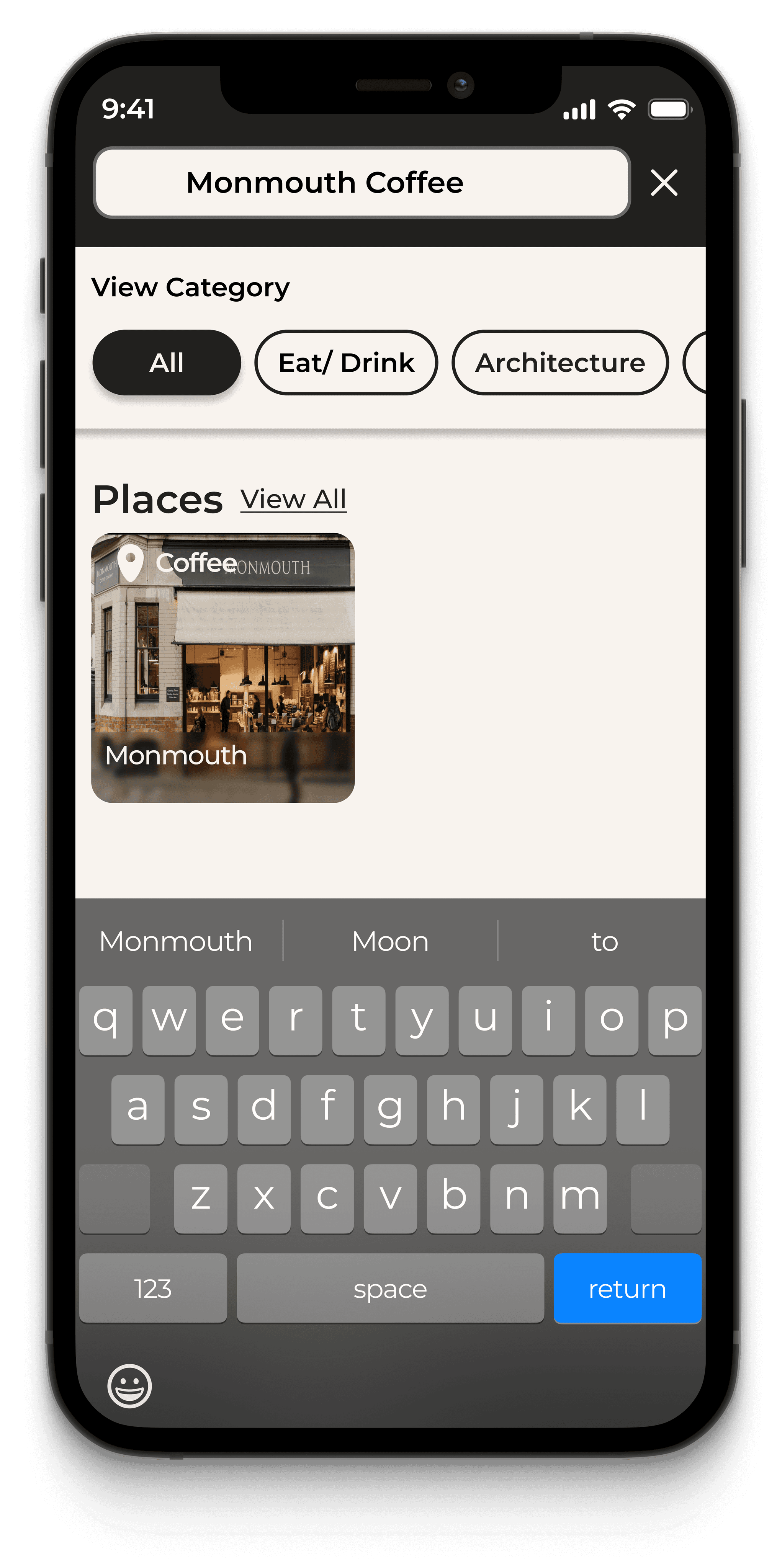
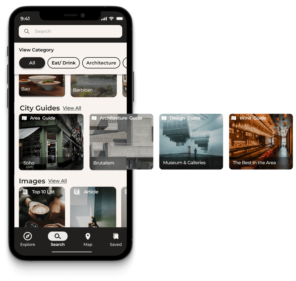
I created a separate, visual search screen with clear categories. This improved user understanding and task completion. While some users still preferred the main feed, many successfully used the new search feature.
RE-DESIGN - MID-FIDELITY
